Repetition
Walmart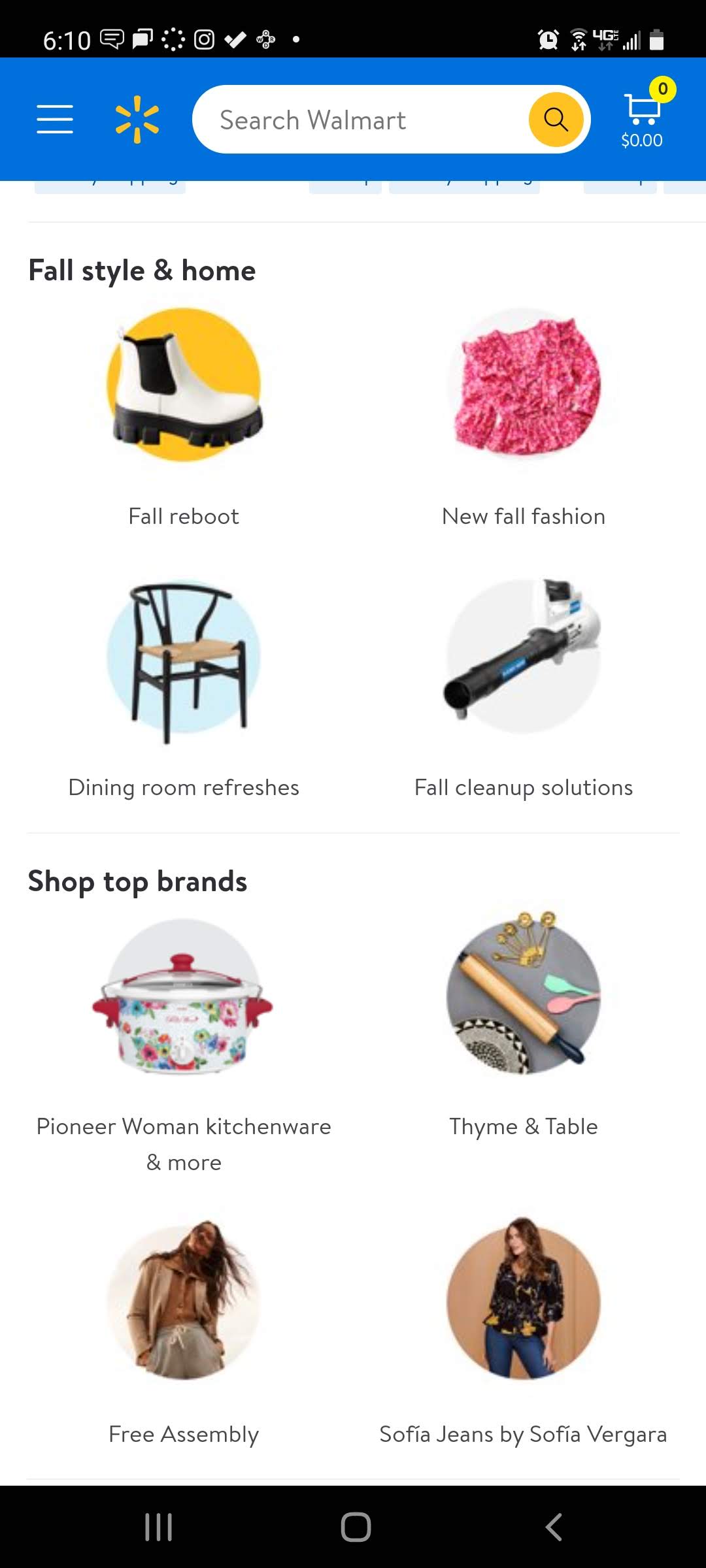
On the Walmart website shows repetition that is shown here for looking through the different categories. It has the heading which shows items you are looking for, as is shown in the image the two headings are Fall Style & Home and Shop Top Brands. Along with more options that are more descriptive like shoes, fall clean up, etc.
Contrast
Pinterest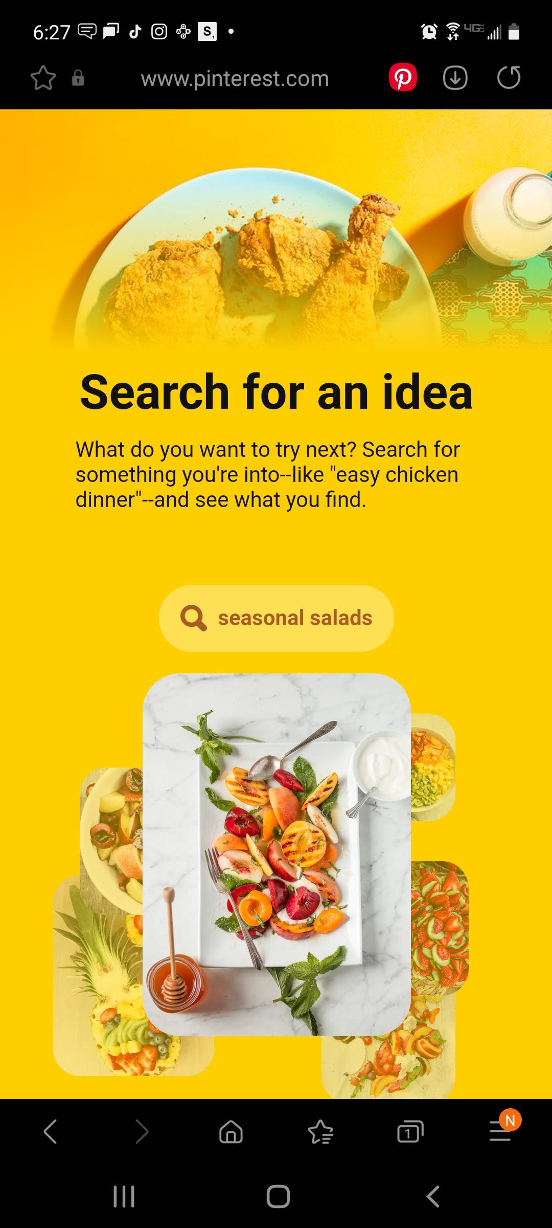
Pinterest shows contrast in the colors of their website, making the background very bright and colorful and then having some food on a white plate which brings contrast and interest to the website. It makes it unique, it also show contrast in the size of the text from the heading text to the paragraph text which is more descriptive. It also has contrast for the color of the search bar it is more subtle compared to the color of the heading and paragraph shown above.
Rule of Thirds
Target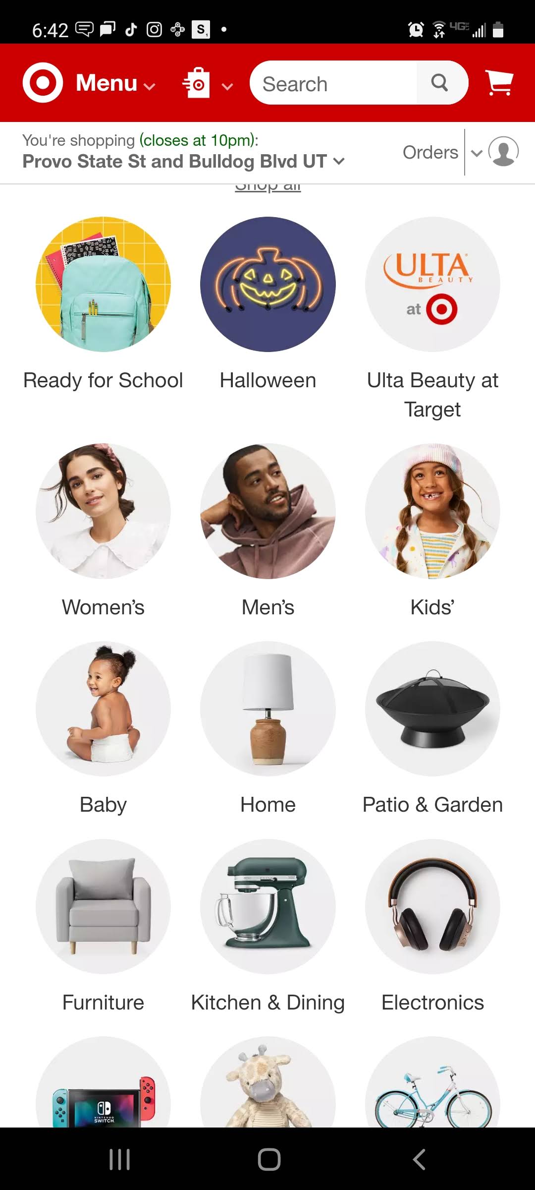
Target's website shows a rule of thirds in their category options, there are three columns which gives the website the appeal of design, it catches the eye of the user, and also makes it easy to find what you are looking for. The columns are also even when it comes to the rule of thirds. It helps the user's eye to scroll down to where it is looking and what they are looking for.